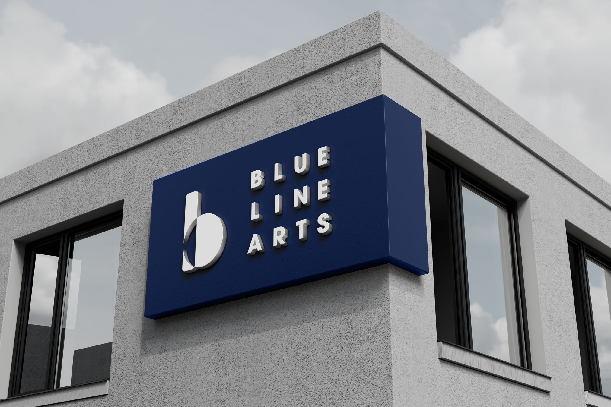
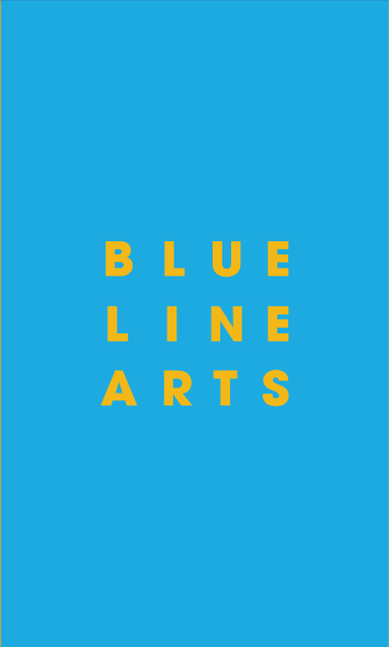
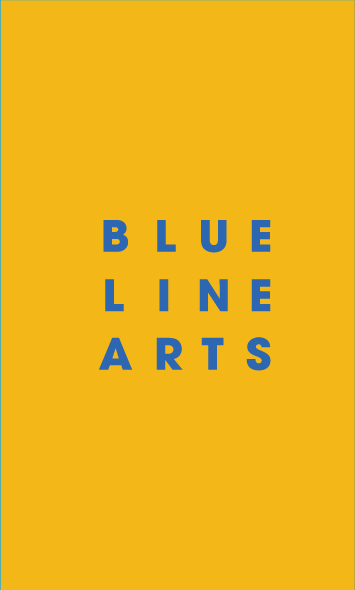
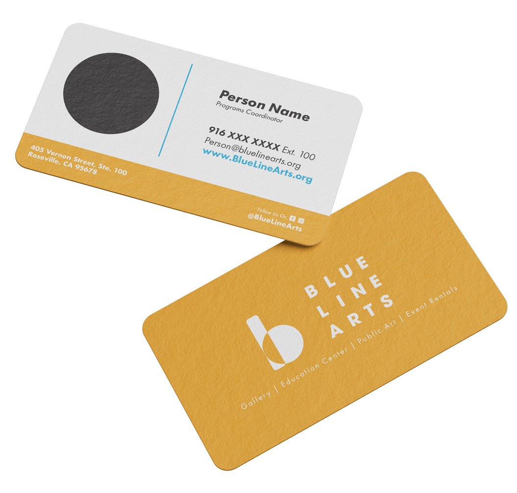
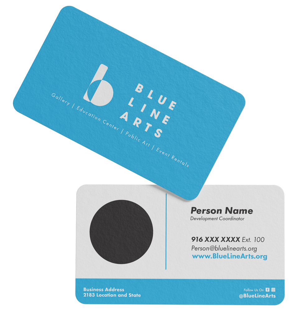
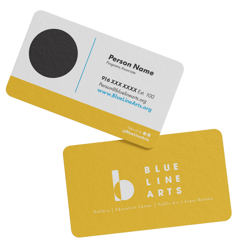
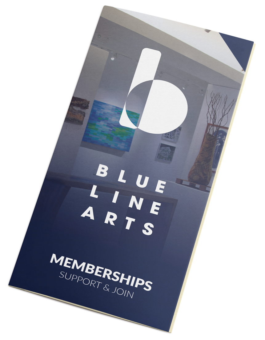
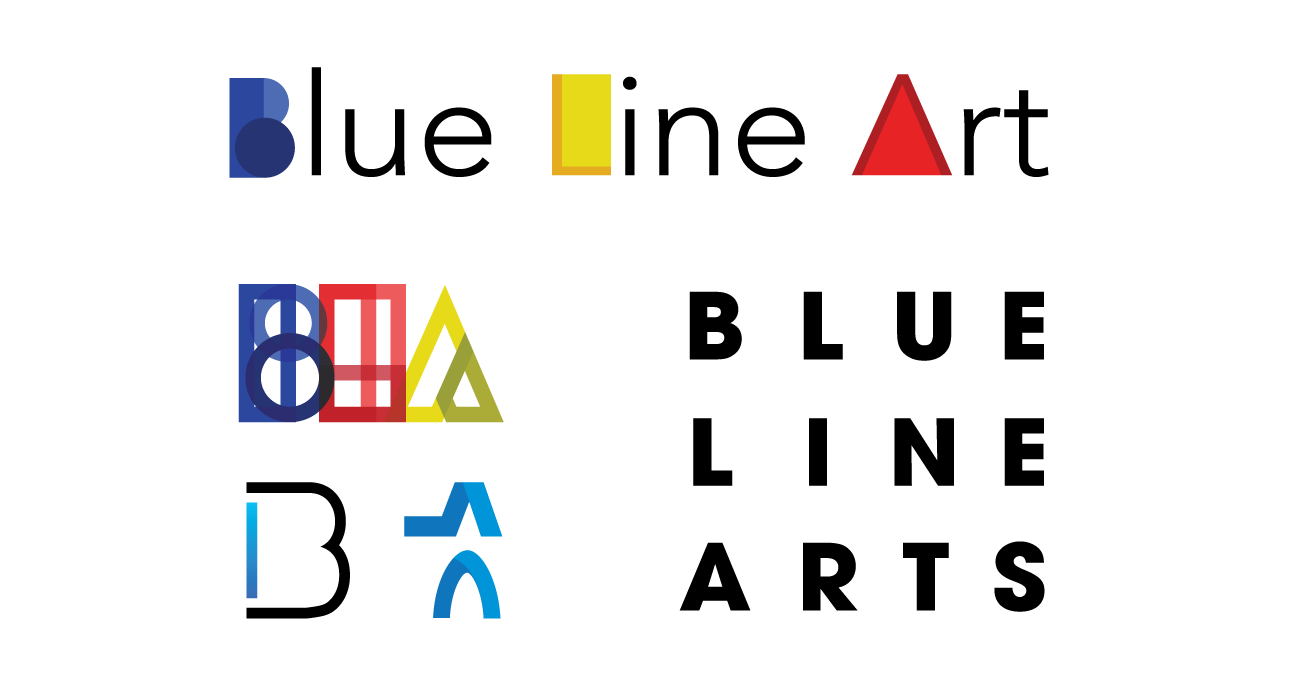
Logo Draft
This needs to represent the people and our cause to give artists a place to grow and showcase their talents.
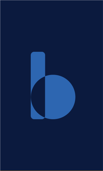
This is a gallery and education center for new and established artists of all ages. I felt the fundamentals should play a part.
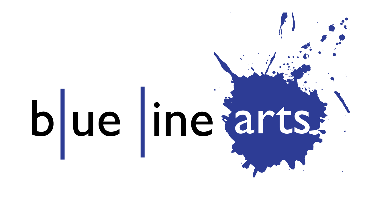
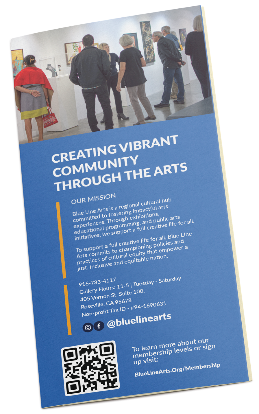
A mark that has lasted a few years and has become a staple in the Roseville area.
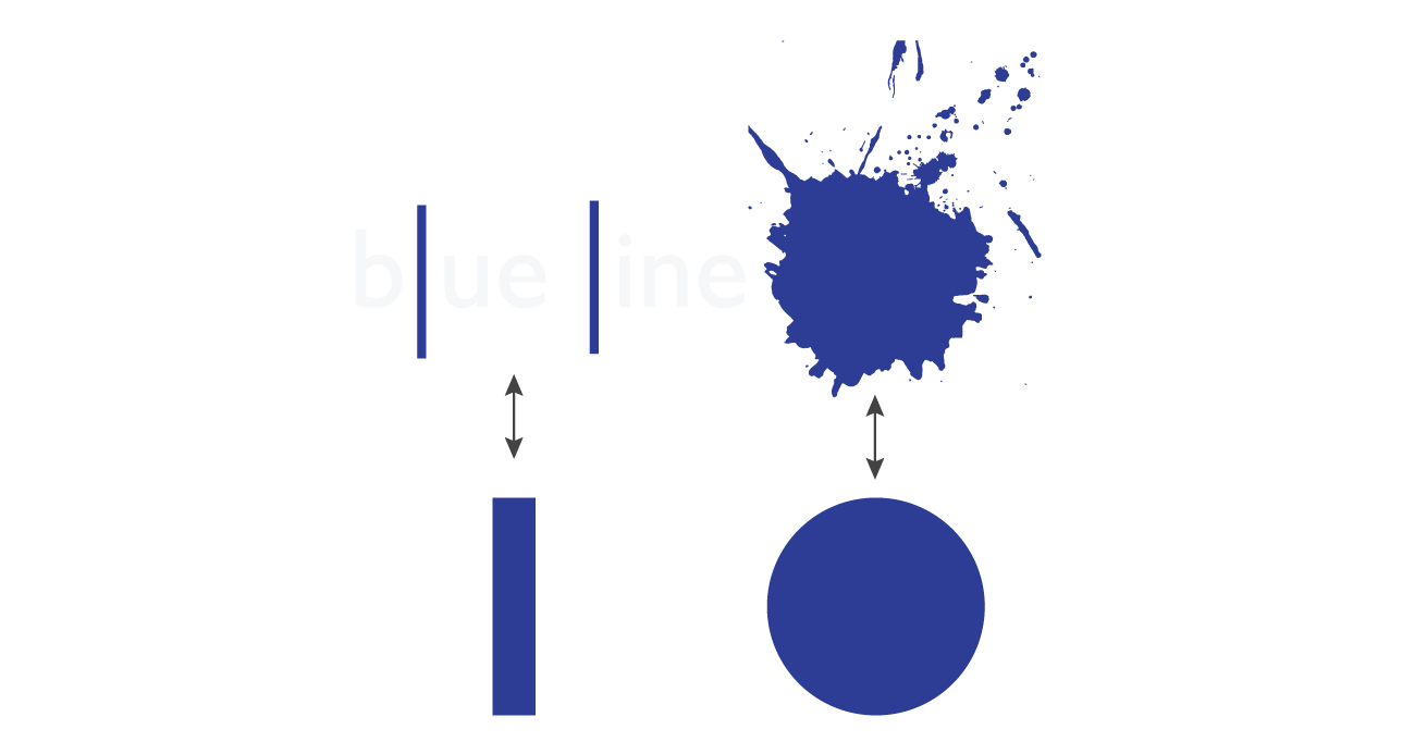
The obvious splatter and blue line dividers were known by the community so they were elements that jump started the path to the new logo.
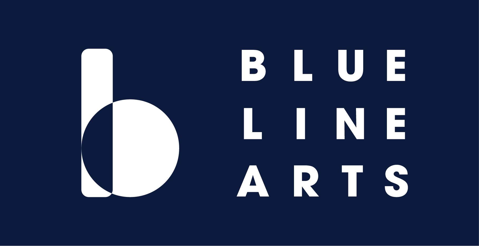
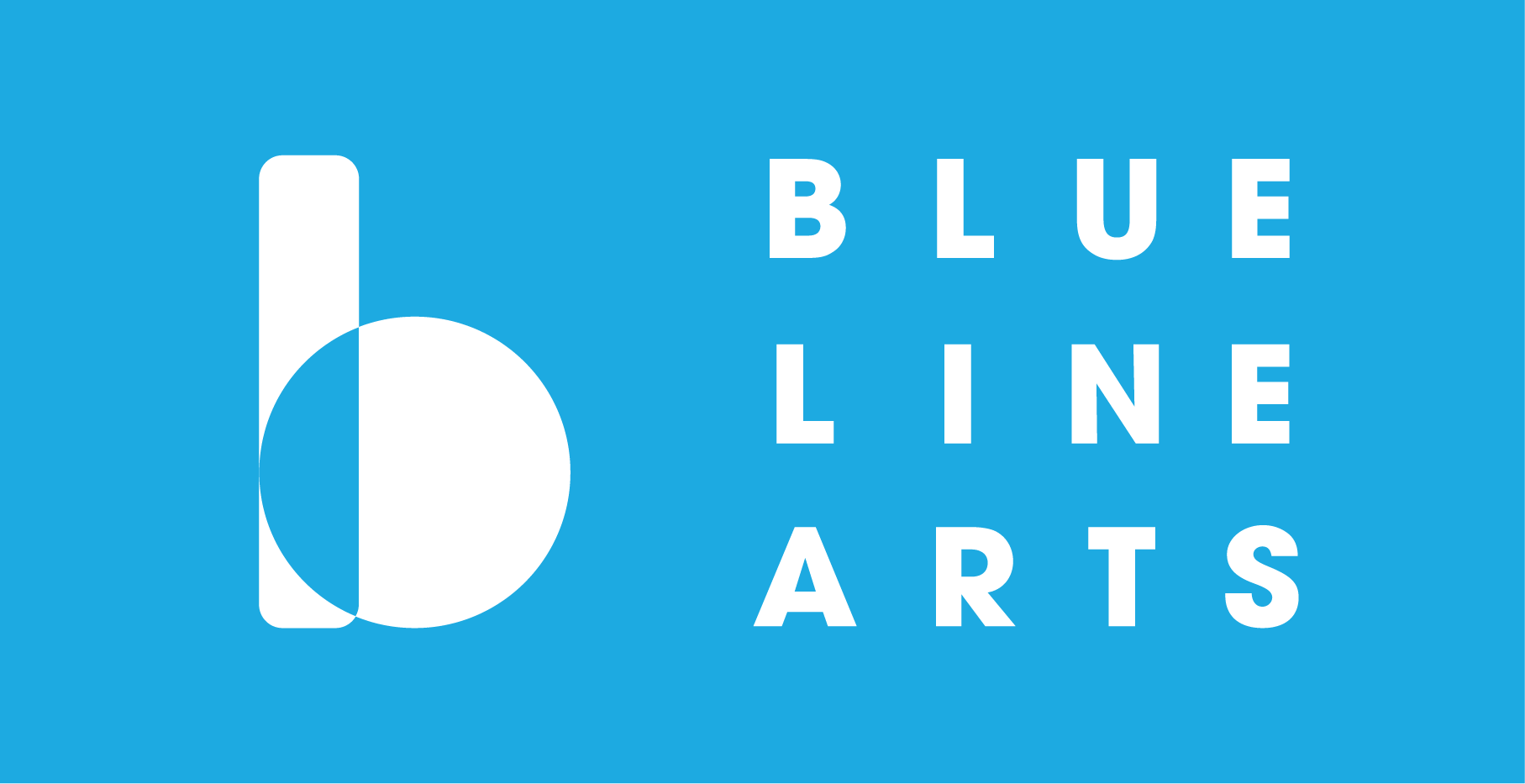
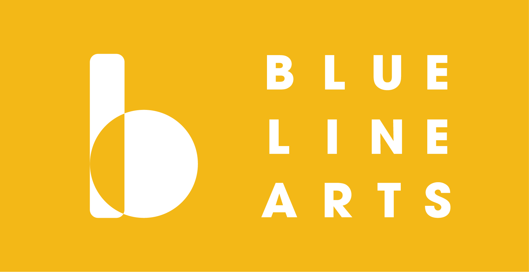
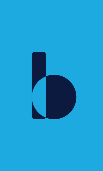
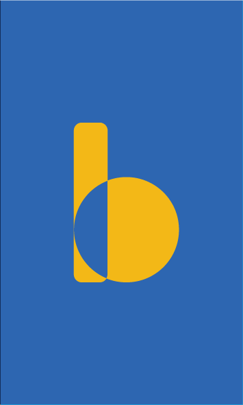
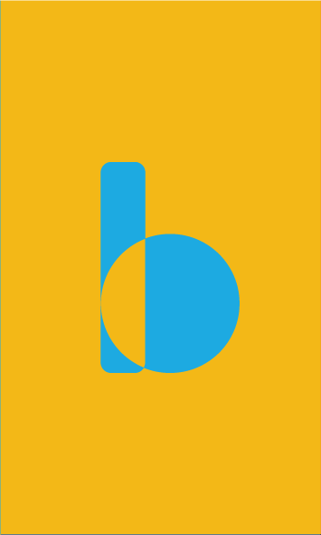
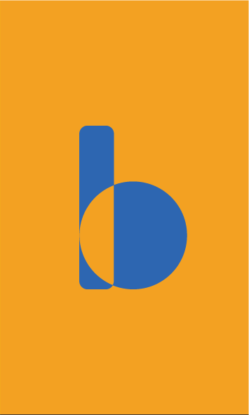
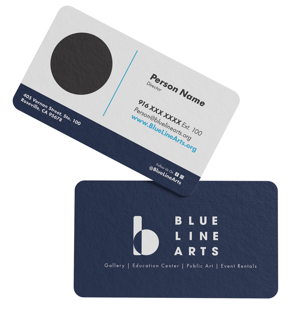
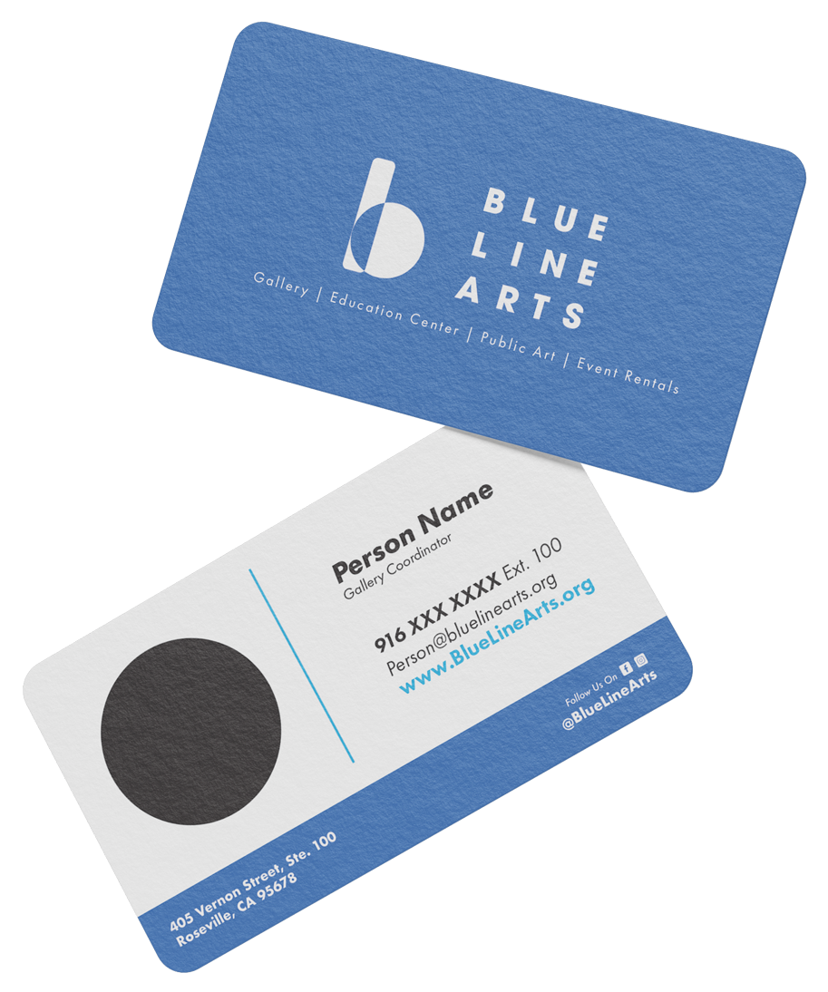
At first the concepts took on a bauhaus look. One concept that stood out in this batch was the Blue B. Using shapes to build the B was something they felt reflected their core values.
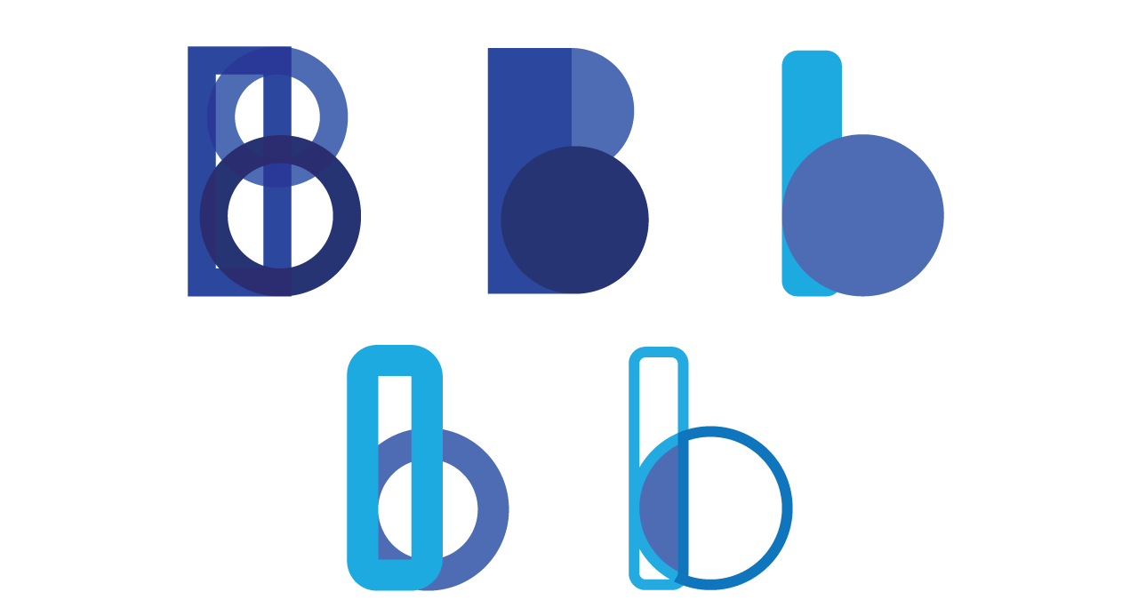
The B was quickly favored by the shareholders and so began the journey of finding the right B while preserving the essence of the original logo elements.