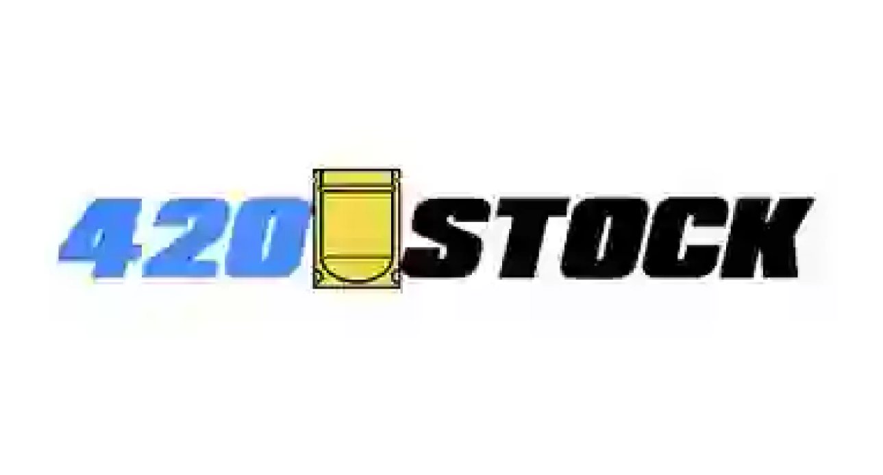
Logo Draft
Clients Brief
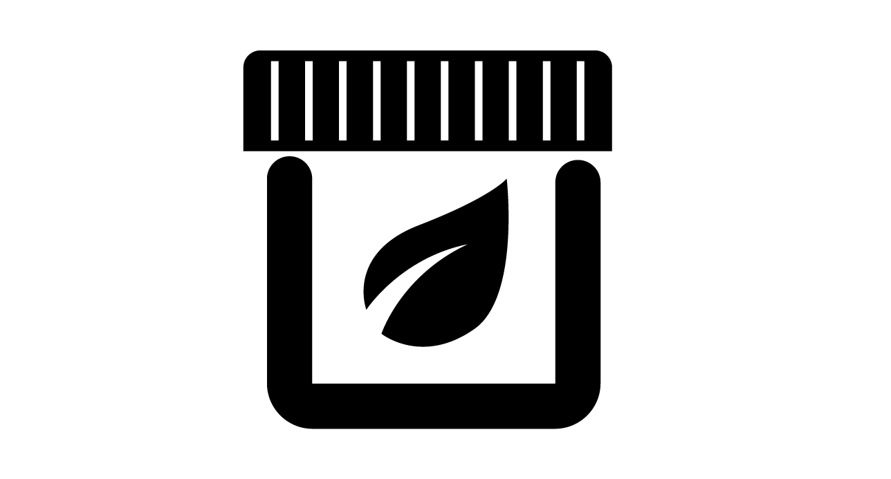
I want packaging to be the focus.
keep blue from 420 in the new brand. Lean a bit more towards a trendy icon.
Initial Thoughts
Glass containers were becoming the premiere method of bottling product so that needed to be the focus for this new mark.
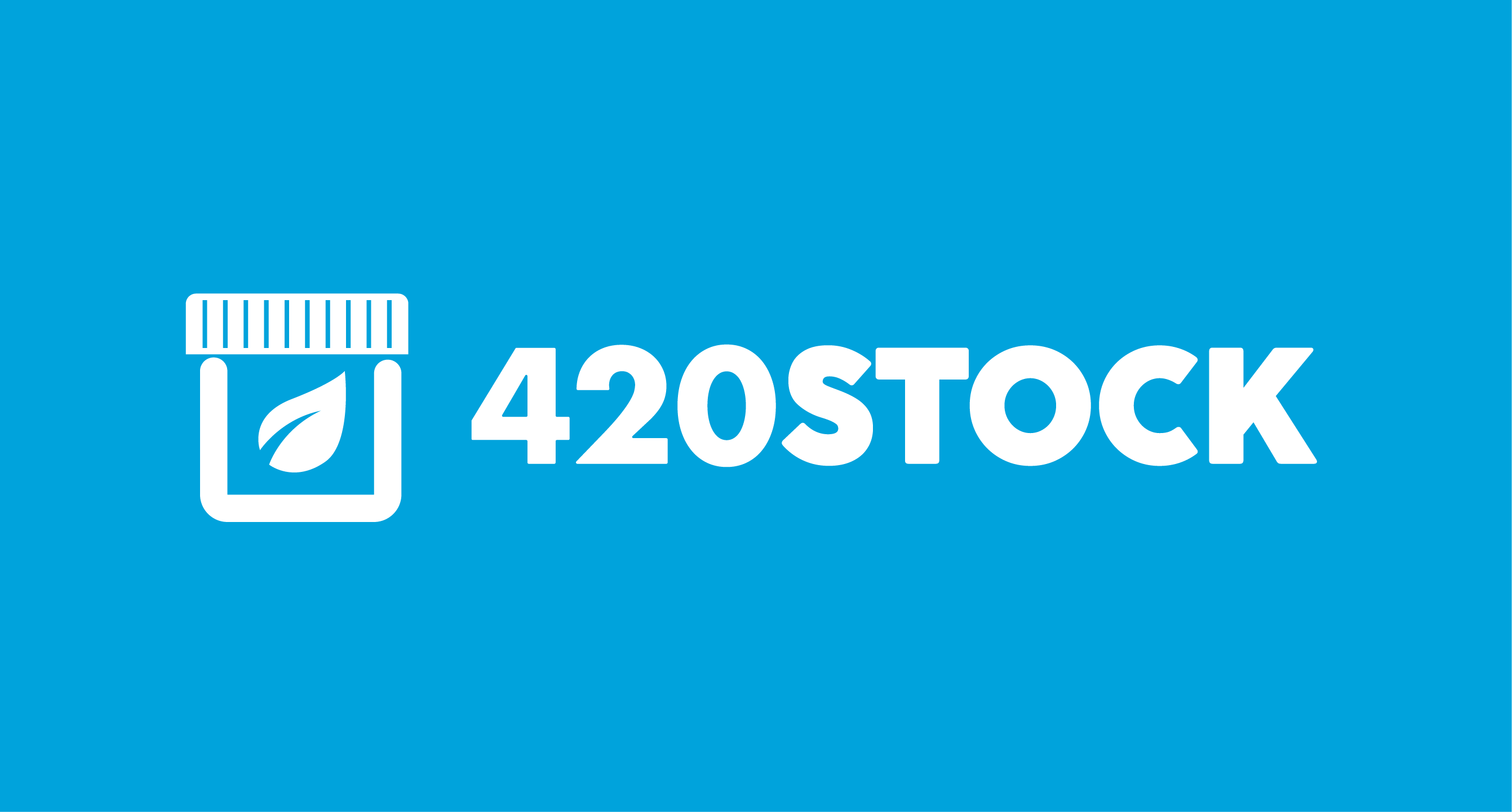
Updated Identity:
The original logo was a mylar bag Icon, Most assumed it was a basketball court. The goal now was to ensure "Herbal Packaging" translates in the new icon and feels more people friendly.
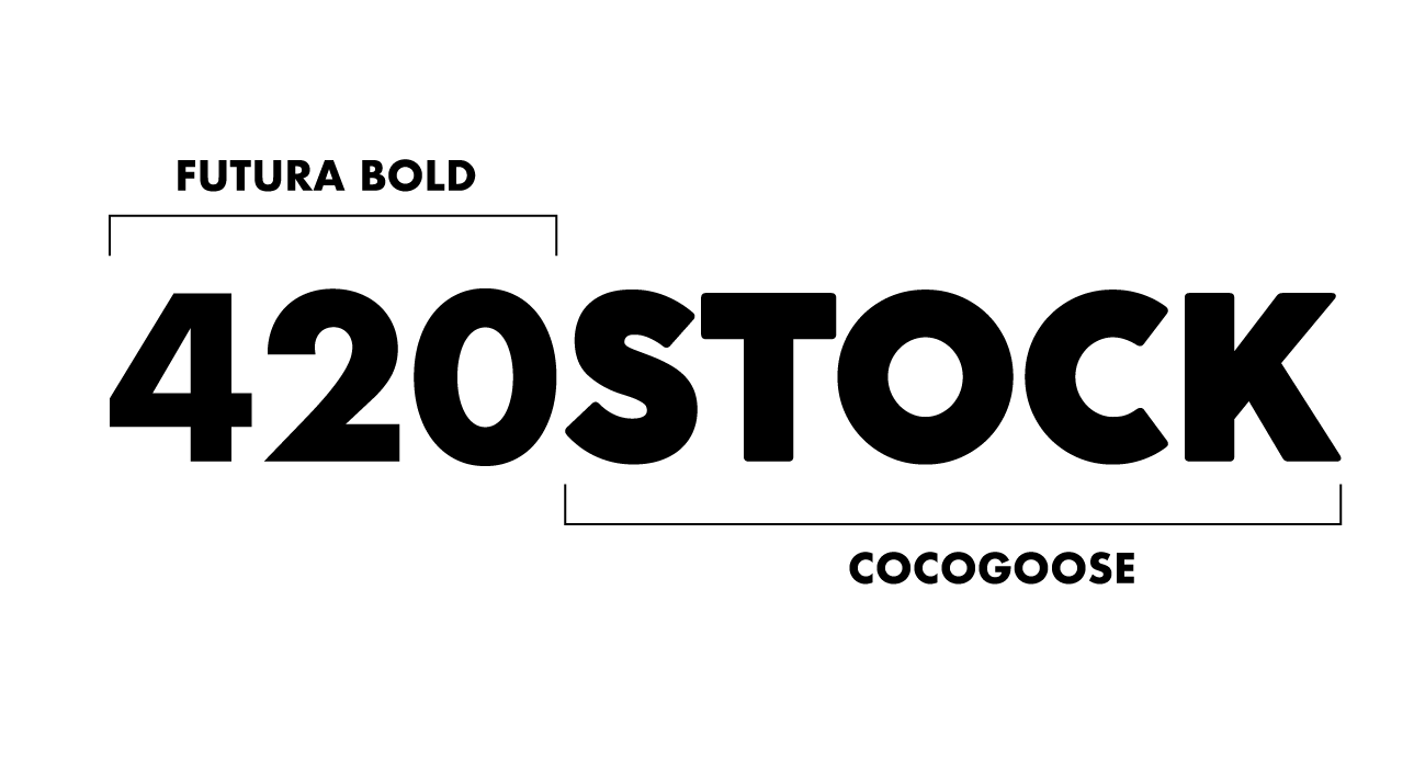
Typeface
The client wanted the letter O and Number Zero to be different. Futura Bold next to Cocogoose gives the impression of a cohesive typeface while still having a clear distinction between the Zero and O.